
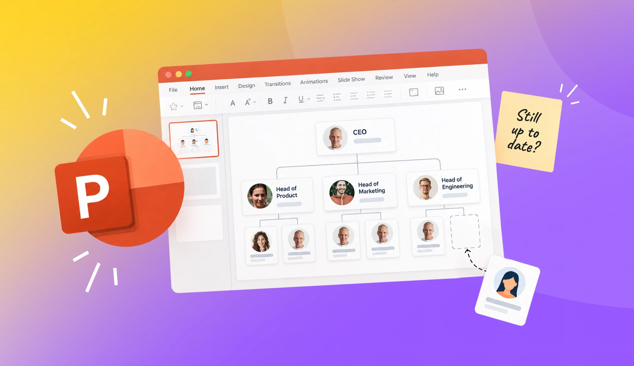
The fastest way to build an org chart in PowerPoint is Insert > SmartArt > Hierarchy, then type your team's names and titles into the boxes — no template download required. That chart is accurate the day you export it and wrong the first time a role changes, and for a 40-person team running two reorgs a year plus a new hire most months, that adds up to a lot of quiet edits nobody remembers to make. OrgaNice's org chart pulls straight from your Slack workspace, so it updates the moment someone's title changes instead of waiting for someone to reopen the file.
- How to make an org chart in PowerPoint
- Using a PowerPoint org chart template instead
- What breaks a PowerPoint org chart in real use
- Manual PowerPoint chart vs. a Slack-synced org chart
- What to do when the chart needs to stay right
How to make an org chart in PowerPoint
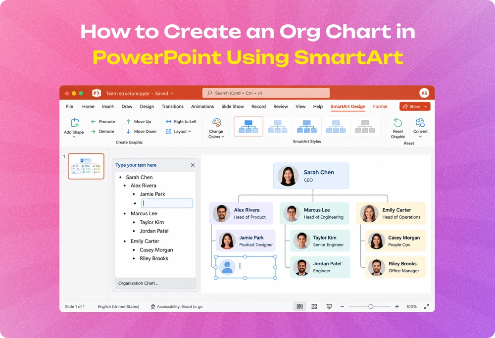
How to create an org chart in PowerPoint comes down to using SmartArt's Hierarchy layout, PowerPoint's built-in tool for boxes-and-lines diagrams. It takes five steps to create an org chart in PowerPoint, from a blank slide to a finished chart.
- Open the slide where the chart belongs and go to Insert > SmartArt.
- Choose Hierarchy from the left-hand menu, then pick a layout. The plain Organization Chart option is the right pick for standard reporting lines — save the fancier layouts (photo boxes, multiple assistants) for cases that need them.
- Click into each box and type a name and title. Press Enter inside a box to add a second line, so the title sits under the name.
- Add or remove people through the Text Pane (View > Text Pane in the SmartArt Design tab). Press Enter for a new box at the same level, Tab to move a box down a level under the one above it, and Shift+Tab to move it back up.
- Format the whole chart at once from the SmartArt Design tab. Colors and styles apply to every box together, so the chart stays consistent without adjusting each box by hand.
Two things trip people up on their first try. The chart can look cramped or overlapping right after adding several boxes — that's the Layout option inside the SmartArt Design tab reserving too little space for the shape count; switching to a taller or wider layout variant fixes it without rebuilding anything. And boxes that won't nest under the right manager are almost always a Tab-level mistake — the Text Pane shows indentation for each level, so checking that view is faster than guessing from the visual layout.
Using a PowerPoint org chart template instead
A template skips the box-by-box setup from SmartArt and starts you with a pre-built structure already in place. PowerPoint ships a handful under File > New, searching "org chart" — and sites like Microsoft's own template gallery and third-party template libraries offer more variety, most of them free.
A template saves the initial setup time, not the ongoing maintenance. Every box still needs a real name and title typed in, and every change after that — a promotion, a new hire, someone leaving — needs the same manual edit a SmartArt chart needs. The template changes how fast you get to a first version. It doesn't change what happens to that version six weeks later.
What breaks a PowerPoint org chart in real use
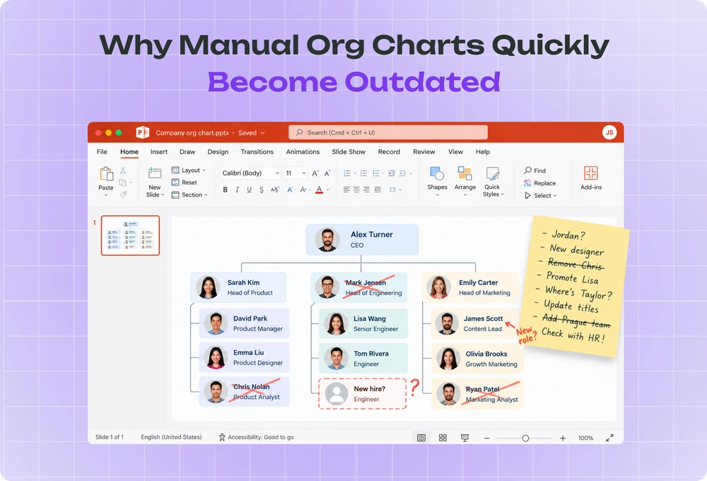
A PowerPoint org chart is accurate at one single moment: when it gets exported or presented. Every change to your team after that point — a title update, a new hire, someone moving to a different manager — makes the chart wrong until someone notices and edits the file by hand.
For a small team, that's not a rare event. A 40-person company running two reorgs a year and hiring about once a month changes its real reporting structure more often than most people update the slide that's supposed to reflect it. The failure isn't dramatic. It's a new hire messaging the wrong manager because the chart still shows the old one, or three people still listed under someone who left two months ago, still sitting in a shared drive as if it were current.
Nobody assigns "keep the org chart updated" as a job. It sits in a folder until a new hire, a board meeting, or an investor update forces someone to open the file, notice how wrong it is, and rebuild the parts that changed.
The person who built the original chart is most often the one who has to fix it, months later, with no memory of which layout choices they made the first time. Re-learning your own SmartArt structure costs more time than building it did, because the file doesn't show a change log — only the current state, with no record of who moved where or when.
Manual PowerPoint chart vs. a Slack-synced org chart
| PowerPoint org chart | OrgaNice org chart | |
|---|---|---|
| Who updates it | Whoever remembers to open the file | Updates itself when a role changes in Slack |
| How current it stays | Accurate on export day, then drifts | Reflects the team as it stands right now |
| Where the team sees it | A file in a shared drive nobody opens | Inside Slack, where the team already works |
| Setup effort | 5–15 minutes per version, repeated every time something changes | Connects once, then runs on its own |
The chart itself isn't the hard part — SmartArt gets a team from blank slide to finished boxes-and-lines diagram in a few minutes. What's hard is the version six months later, after four title changes and a reorg nobody circled back to update.
OrgaNice's version reads reporting lines straight from your Slack workspace — who reports to whom comes from how your team is already set up in Slack, not from a second form someone has to fill out on top of it. Change a manager, add a new hire, or move a team under a different lead, and the chart reflects it the next time anyone opens it, without a second step to keep the two in sync. Building a winning org chart for your business covers what makes a structure worth documenting in the first place, before deciding which tool should hold it.
What to do when the chart needs to stay right
If your team's structure almost never changes — a five-person founding team that hasn't grown in a year — a PowerPoint chart is a reasonable, low-effort choice. Rebuild it when something changes, and the manual cost stays small because the changes are rare.
If your team is growing, reorganizing, or hiring on any real cadence, the manual cost compounds. Each edit is small, but the person responsible for making them is doing unpaid, unscheduled maintenance work that nobody assigned and nobody notices until the chart is wrong in a way the whole team can see.
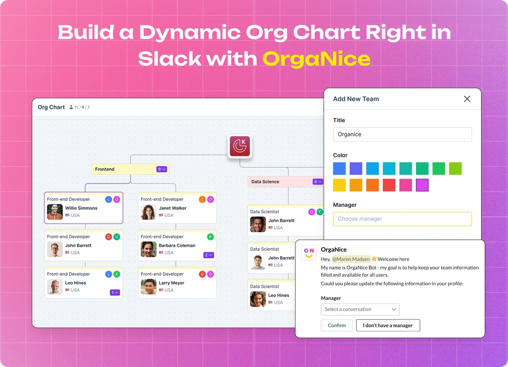
OrgaNice's org chart removes that job — it reads your team's structure straight from Slack and stays current without anyone opening a file. At $1.25 per person per month for the full stack, that's the price of never rebuilding the chart from memory again. Org chart best practices and what a dynamic org chart does go deeper on what a chart worth keeping current looks like once you've decided to stop rebuilding it by hand.
Questions, answered.
Click into an existing box, open the **Text Pane** (**View > Text Pane** in the **SmartArt Design** tab), and press **Enter** for a new box at the same level or **Tab** to add one below the current box. PowerPoint reflows the whole chart on its own as you add boxes, so the layout stays even without manual spacing.
Draw it with individual shapes and connector lines from the **Insert > Shapes** menu. It gives full control over spacing and layout, but every box, line, and alignment is manual — a 15-person chart built this way often takes an hour or more, against a few minutes with SmartArt.
No. A PowerPoint file is a static document — it holds whatever was true when someone last edited it, and nothing inside PowerPoint watches your team roster for changes. An org chart that updates itself needs a tool connected to where your team data lives, like Slack.
None — SmartArt's **Hierarchy** category is what PowerPoint calls its org chart tool under the hood. Picking the plain **Organization Chart** layout inside that category gives the standard boxes-and-lines format most teams mean when they say org chart.
OrgaNice runs $1.25 per person per month for the full stack, including the org chart. Manual PowerPoint charts have no subscription cost, but someone still has to notice every role change and re-edit the file — the real cost shows up as time, not a line item.